What is it and how to get it?
As brands and companies rush towards creating a digital-first business with personalised customer experiences, there is still a significant chunk of the population who would attest that brands aren’t doing enough.
Who are this chunk? The 20% of the UK population who are living with a disability. Scope, a prominent disability equality charity, recently pointed out that 98% of homepages across a range of 1 million popular websites didn’t meet legal accessibility standards as of early 2019. And as the purple pound (the spending power of disabled families) is now estimated to be worth £249 billion per year, ignoring the accessibility factor of your digital platform or product could prove very costly.
How can you check your site is accessible? Ask yourself:
“Are there alternative text sizes for your visually-impaired customers?
Can your customers use your site with only a keyboard?
Have you structured the information so that it can be understood by assistive technologies eg screen readers?”
If the answer to any of these questions is ‘No’, you need to start thinking about improving your AX (accessibility experience).

Short term solutions
Realising your platforms don’t meet accessibility standards can be a daunting conclusion to come to, but there are some straightforward steps you can take to get started.
1. Contact details
The quickest way for you to understand the digital accessibility flaws with your platform is by enabling users to flag any usability problems themselves. Clearly displaying contact details means you are open to constructive feedback and will enable you to quickly reduce major pain points along the customer journey as soon as possible.

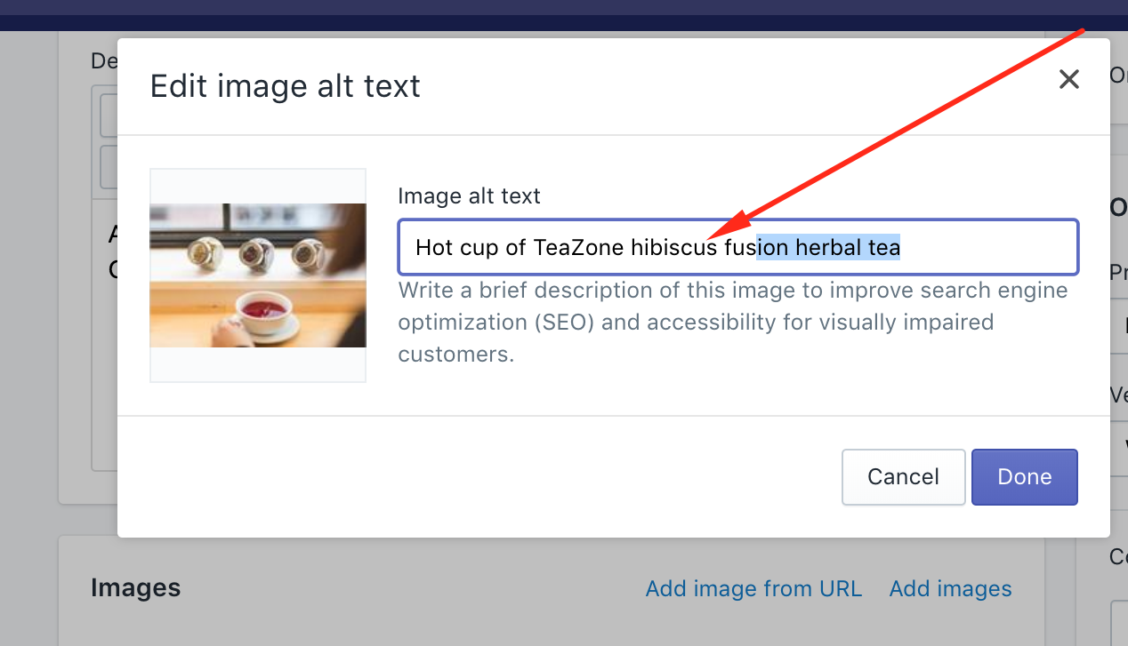
2. Alternative text for images
Some disabilities require assistive technologies such as screen readers. These technologies read the alt-text of images, which needs to be meaningful and describe what’s in the image but not overly descriptive or confusing. The added benefit? Adding alt-text is great for your SEO.
3. Visual & audio options
Today’s heavy use of rich media and video content across websites and apps can make digital platforms even harder to navigate and understand for those with a disability. Can customers get all the important information from your videos even if they can’t see them? Can they get all the information they need from your videos even if they can’t hear them? Offering alternative visual and audio options such as subtitles, transcripts and voice-overs are small but significant changes you can make to be more inclusive.
.png?width=1920&name=LockupNoText_Horizontal%20(00000).png)
4. Don’t depend on colour alone
There are many UX and design considerations to take into account when improving your digital accessibility, but for those with visual impairments such as colour blindness, it is crucial that digital platforms never depend on colour alone to convey information. And when colours are used, they need to be of a sufficient contrast.
On the other hand, there are audiences, such as those with learning disabilities, who will benefit greatly from colour being used to distinguish between options and content. The takeaway here is that when picking colours for your platform, there are a number of factors to consider in order for your designs to be accessible.
.png?width=1920&name=Frame%2004%20(00000).png)
Looking long-term
These four steps are often quick wins as organisations move to make their digital properties more accessible. Of course, depending on your audience, you may need to make some more fundamental adjustments. This is easier to undertake from the start of a project but if you’re not at this stage, adding accessibility features doesn’t need to be a complete overhaul of your website or app.
Working in an agile fashion, enables accessibility improvements to be incorporated seamlessly at both the beginning or middle of a project:
Rolls-Royce
Being an international enterprise means Rolls-Royce, and by extension Candyspace, need to meet Triple A Conformance standards in their design systems. One particular design system was for applications that were presenting safety critical information - where conditions may mean people are using the app in stressful situations.
To meet these requirements, the design team considered the colour of the copy, calls-to-action (CTAs) and data visualisation features. The contrast between background colours vs copy and primary vs secondary CTAs needed to be sufficiently different to be quickly distinguishable and be accessible to those that are colour blind. Candyspace used official online checks to ensure text sizes, contrasts and data visualisation colours were all sufficiently differentiated so that information could be quickly read and understood across a variety of conditions.
ITV
As the UK’s number 1 independent broadcaster, it is crucial for ITV to offer digital products that are accessible to all. It is an increasing priority for them, so Candyspace worked closely with the client to begin implementing accessibility features across their existing iOS and Android platforms. These features include voice-over on iOS and talkback on Android, subtitles for the audibly impaired and audio-described content for the visually impaired. The audio-described section has larger text and images by default and this UI becomes the default if the user has voice-over or talkback enabled.
Good accessibility practices shouldn’t be an afterthought, they should be baked into your design and development and considered in each stage of the decision-making process. So, while everyone else is concerned with good UX, you could be one step ahead by thinking about AX (accessibility experience) practices and ensuring that your company isn’t missing out on the purple pound or ignoring less-abled potential customers.