Keep your users in mind, and focus on making their lives simpler.
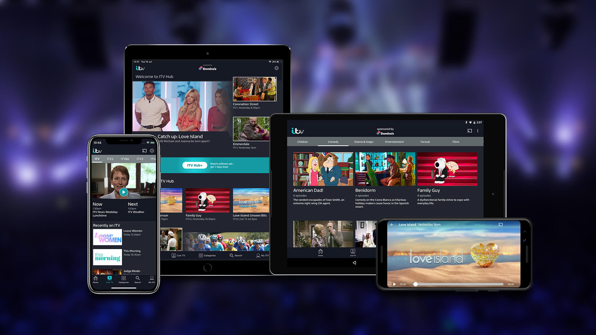
When you’re managing a product, it’s easy to want to stuff it full of shiny new features, alerts and notifications. But what users really want is something that works. And when we’re talking VOD, that means an app that lets them watch the shows they want to, when they want to watch them, wherever they may be. Simple, right?
It’s this clarity and user-focus that will keep customers coming back to your app, and bring in new users through word of mouth.
In a market where users have more choice than ever before in how they watch content, this is even more important. With big new players including Apple and Disney coming on to the VOD market within the next 6 months, implementing the right strategy to acquire and then retain users is critical. Often a brand’s vision can be clouded by their own strategic and marketing goals, and the user’s voice gets lost. Priority can be misplaced on areas that aren’t high value for the user, which force things that users care about far down the product backlog. Keeping a watchful eye on this, and questioning the user value of those items at the top of your backlog will save you from falling into this trap.
Importance of the App Stores
Before users even have your app in their hands, there’s an important step that is often overlooked: the app stores. Optimising what is effectively your shop window will maximise user acquisition, but also increase the effectiveness of all your other marketing activities that are driving potential users to this destination. Having the right strategy in place for keywords is crucial for app store optimisation, but keywords aren’t everything.
Think about your use of imagery, your descriptions, and the consistency of the message being shown. Too often keywords will be at odds with the app description users see, so your app will appear in searches but seem irrelevant when users tap to read more. Focus on bold imagery and short copy with a clear message - keep fonts large so that they are legible on mobile screens. Most important of all? Test with users. The days of the creative director being king are gone. Copy and imagery decisions are so subjective; crowd-sourcing opinion by doing A/B testing is the best way to guarantee effectiveness in market.
Once users have your VOD app in their hands, what is it they want? The key is to look for ways to make your user’s life simpler and reduce friction for them when using the app.
.jpg?width=673&name=VOD%20-%20Potential%20pic%20(1).jpg) There are some simple but effective ideas already out there on the market that have created a benchmark for consumer expectations. For example, the Netflix model of autoplaying the next episode is a simple but genius idea that made binge watching the norm. And BBC iPlayer’s quality controls mean users can choose to watch their sports at home in HD but switch to lower quality downloads for their commute. Amazon Prime allows users to download an entire series with one click. And Netflix’s Smart Downloads lets users download the next episode automatically when they are close to the end of the previous one.
There are some simple but effective ideas already out there on the market that have created a benchmark for consumer expectations. For example, the Netflix model of autoplaying the next episode is a simple but genius idea that made binge watching the norm. And BBC iPlayer’s quality controls mean users can choose to watch their sports at home in HD but switch to lower quality downloads for their commute. Amazon Prime allows users to download an entire series with one click. And Netflix’s Smart Downloads lets users download the next episode automatically when they are close to the end of the previous one.
How else can a VOD app make their user’s life easier?
Don’t make your users search for the shows they want to watch - use data to present them a personalised homepage filled with the content you know they watch already, and help them discover new content they’ll like based on similar user’s viewing habits. Onboarding can also be used as an opportunity to get to know new users and the content that interests them, so they too can have an experience tailored to them. And voice search will make life easier for everyone, not least kids and users with different accessibility needs.
Keep that user-first mantra in mind when it comes to push notifications - make sure they are relevant and only send users notifications about shows they have previously watched, otherwise you run the risk of annoying your users or even driving them to delete your app.
And then of course keep inspecting the data. Your users’ behaviour, how they are using the app and where they are dropping off, will provide you with the best learnings. In short keep using those insights with purpose, and never ever think your app is “finished”.
None of this is rocket science, but keeping an unwavering focus on your shop window - the app stores - and your users, so that using your app and consuming your content is as simple as it possibly can be is key to building an app that people will return to again and again.


