What does a human have in common with a robotic dinosaur?
If you’ve ever seen Jurassic Park, you might remember the scene where a rampaging T-Rex stumbles upon our heroes in the rain. With nowhere to hide, Palaeontologist Dr Grant advises his terrified team to stay still. “It can’t see us if we don’t move.”

Sadly for all of us, Grant’s theory was debunked in 2006 by a real Palaeontologist, who popped some crocodile eyes into a scale replica of a Tyrannosaur head to evaluate the quality and nature of their vision. For anyone interested, they could see better than hawks or eagles, whether you’re playing musical statues or not.
Whilst we don’t share that much in common with prehistoric reptiles, it turns out that humans share the same reliance on movement to determine what to focus our attention on as an angry, mechanical T. Rex. We’re hardwired to pay attention to changes in movement more than any other visual stimulus, and to predict motion so effectively that we automatically perceive where something is likely to be a few milliseconds into the future. Even static images that simply IMPLY movement cause an enormous increase in positive brain activity, another indicator of how important motion is to the way that we experience the world around us.
Put simply, if it doesn’t move, it’s far less likely we’ll notice it.
With this in mind, it should come as no surprise that some of the biggest digital companies consider animation as a defining component of their online presence. Facebook, Google, Netflix; all benefit from slick, distinctive and unique experiences, made so not just how they look, but how they move, and therefore, how they feel. Animation is one of the 5 core pillars of interaction design, contributing in a major way to how users interact with digital products.
To avoid sounding like a ‘capital C’ creative, and in hopes of taking the conversation away from the nebulous realm of ‘feeling’, here are 5 tangible ways that integrating animation into your website can lead to more meaningful digital experiences:
1. Convey your brand’s personality

Whilst a brand’s personality can be communicated partially through good imagery and design, you can communicate a lot more about the nuance your brand’s identity through how it moves. For instance, if you want to put yourself forward as a fun, quirky, vibrant brand, you might want a site that features lots of big, bouncing animations, different characterful hover states/loading screens/icons, and fun interactive elements that pop out and get the users attention. If, on the other hand, you want to portray yourself as a slick, premium and professional service, you can convey much of that through smooth interactive elements and confident page transitions. Animation is a great way of separating yourself from the crowd and delivering an experience that is not only memorable in its own right, but which helps the user recall the personality of your brand.
2. Direct your user’s attention

With multiple elements moving off and on-screen throughout any digital experience, it’s often challenging to bring the most important elements of a content-rich experience to the users attention. Leveraging animation as part of interaction design provides a great way to break this information down for users, employing techniques similar to those employed in the world of filmmaking to help draw the eye to an experience’s most important elements. By staggering the animation of elements onto a webpage, you can give the viewer the chance to absorb each piece of the puzzle in the order you set out, making complex journeys and stories easier to tell quickly and effectively.
3. Provide interaction feedback

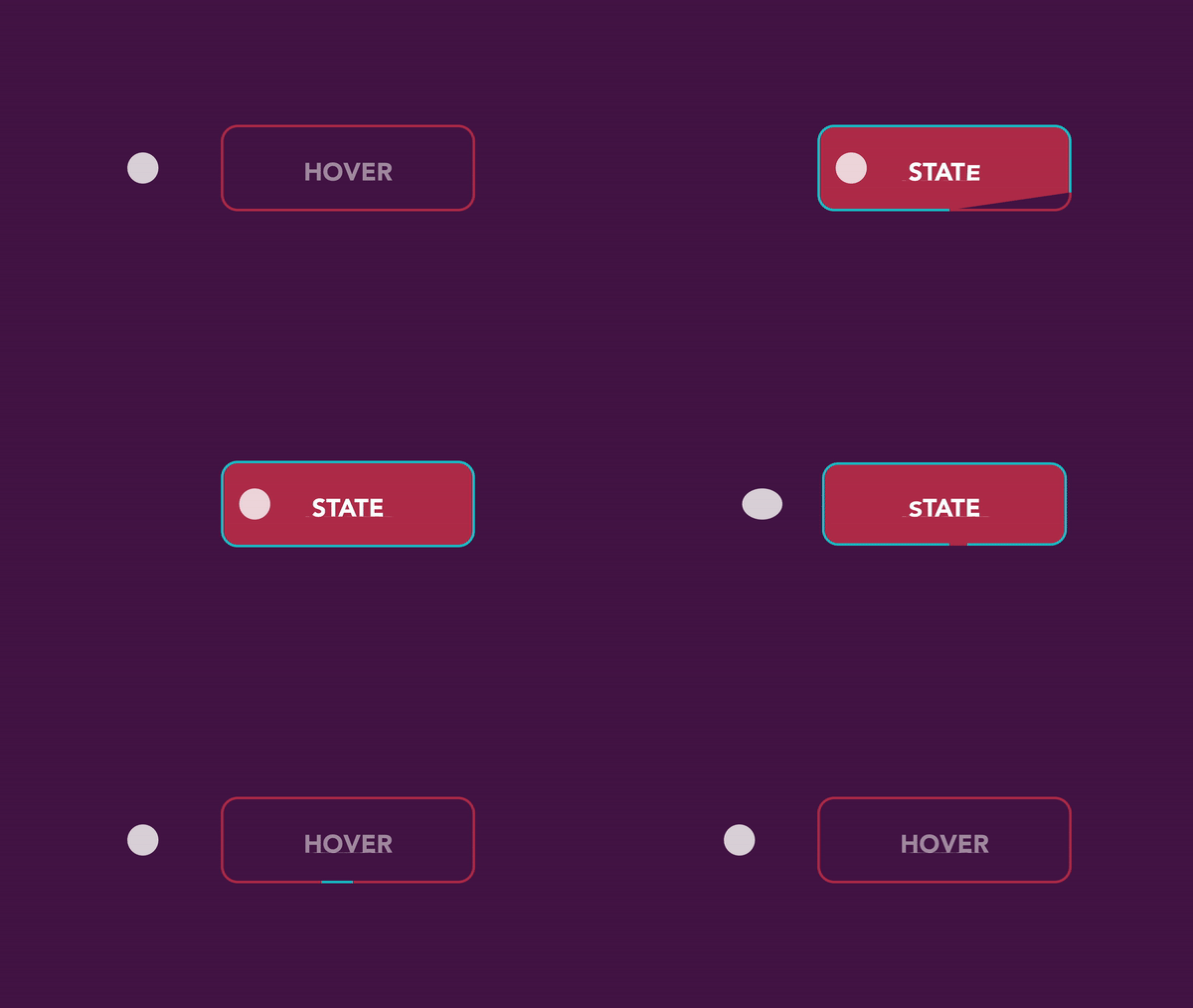
There is nothing more infuriating than being stuck on a website, not wondering whether the next page is loading or not, or if the button you tapped is actually doing anything. Letting users know that their inputs are working is the least you can do for your users, and is a core component on delivering good UX/UI design. Moving a step above pure function, having a rich and interactive experience also makes your users feel connected, gives them a sense of agency, and encourages them to engage by rewarding them with positive reinforcement through animated feedback.
4. Guide your users

As well as helping shape the order in which your users look through content, Animation also forms a great way to encourage people down a particular user journey, something that you can use to increase KPI performance. Need more sales? A big, shiny, animated ‘Buy Now’ button will get people paying attention and, with any luck, clicking & tapping through. If you know that the majority of users are looking for a particular menu item on a page, adding an animation next to that item will get people paying attention and moving through to where they want to go quickly.
5. Create a richer experience

Sorry. We can say ‘more immersive’, ‘more premium’ or even ‘mas Luxe’, if you’d prefer. But at the end of the day, the undeniable fact is that a digital experience that utilises good animation makes your brand seem more considered, purposeful, and user-focused. From subtle button animations to full-on crazy 3D sites that blur the boundaries between a website and a game, meaningful (or occasionally flippant) use of motion in a web experience leads to more memorable experiences that impress your audience. Who doesn’t want that?!
So, there you have it; 5 reasons why you should consider animation as one of the tools in your toolkit when creating an amazing digital experience. If you think your website could do with some animation to help bring it to life, let us know!


